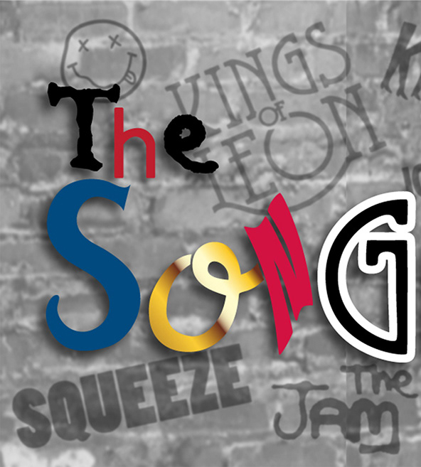
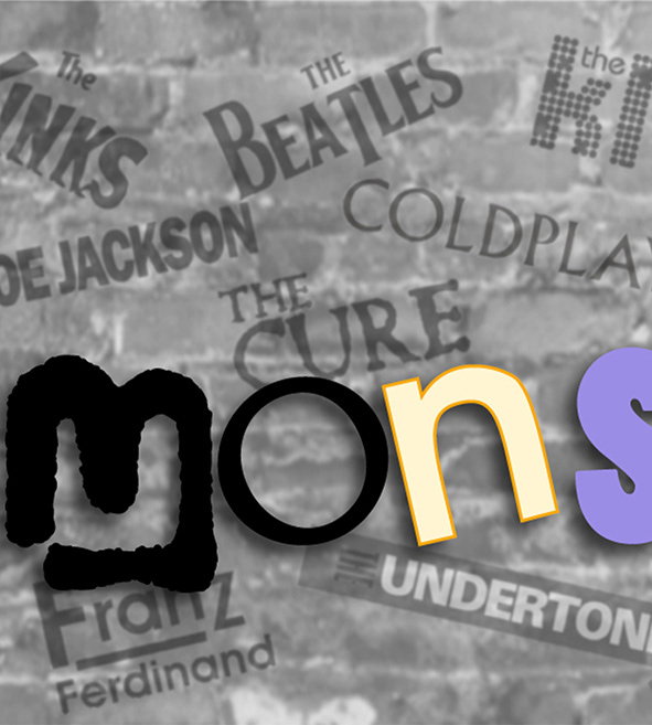
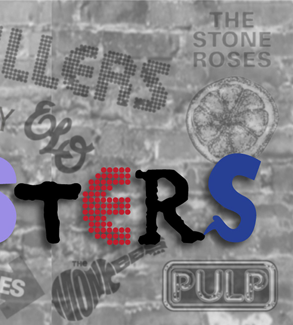
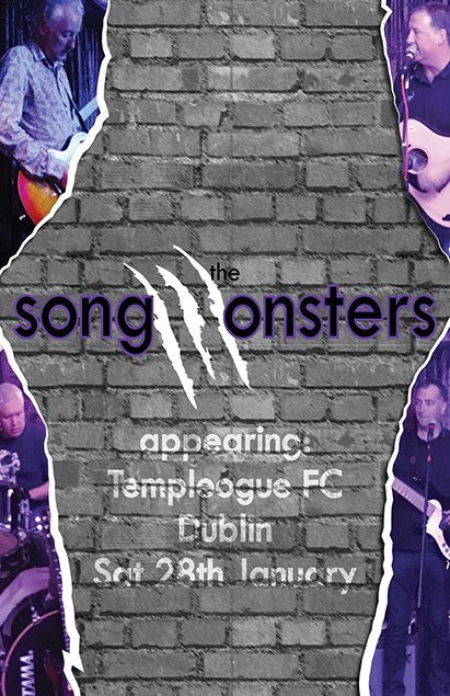
I was commissioned to design print media for a local covers band and created two design concepts. For the first design I used letters from band logos to construct the band’s name, set against a wall of logos. For the second I replaced the letter “M” with claw marks and featured band photos layered on ripped paper against a brick wall background. The band selected the first concept for final production.